Allowing Dog Lovers to Easily Rescue Their Perfect Furry Friend
Redesigning a responsive website on mobile & desktop
for Westside German Shepherd Rescue of Los Angeles
A conceptual project

Western German Shepherd Rescue (WGSR) has a wonderful mission: to rescue German Shepherds from high-kill rate animal shelters and find them permanent loving homes. However, their existing website is clunky and people complain at length about the unfriendly adoption process on public review sites. WGSR needs a site that allows adopters to easily find and adopt their dream dog. The organization also needs to easily collect donations in order to support itself.
The Team
Manali Sibthorpe
Jessica Guo
Jordan Masuret
Tools
Figma
Miro
Optimal Sort
Deliverables
Mobile website prototype
Desktop website prototype

Duration
2-week sprint
UX Methods
Heuristic evaluation
Card sorting
Persona + scenario development
User flows
User interviews
Affinity mapping
Wireframing
Design strategy
Usability testing
Iterative prototyping
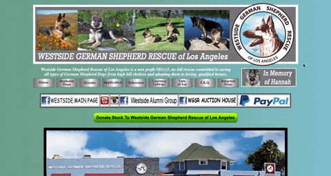
In summary, we took the site from this…
…to this

We wanted a clean and friendly design that people could trust to inform them about the adoption process. But let’s start the story at the beginning, with research.

Research responsibilities I owned:
Heuristic evaluation
Card sorting
Writing the persona + scenario
User flows
There’s no gentle way to say this: the original site was chaotic, both aesthetically and in regards to the way it’s organized. Card sorting revealed how users expected the information of the site to be organized which enabled us to get the main navigation categories from 10 to down to 5.

User interviews + Affinity mapping
We were looking for insights into the dog adoption process so we performed user interviews with people who had adopted rescue dogs in the past. We wanted to understand the emotional effects adoption had on them and what their motivations for adoption were.
We then synthesized the information through affinity mapping. An interesting takeaway we hadn’t expected was to hear that adopters felt like they needed much more guidance once they took the dog home. This led us to develop educational content as one of our four main features of the MVP.
Lo-Fi Wireframing
The big goal here was to simplify the layout from what it had been previously.

Design
It was clear that the original design needed to be toned down and simplified. The original logo was quite charming so we kept that. Keeping the logo helped us maintain brand identity and informed our choice of blue as the primary color of the design. We identified four areas that if improved, could lead to a seamless adoption process.
The adoption form
Browsing for available dogs
Educational content for adopters
Simplified donations
Redesigning the adoption form for clarity
I owned the redesign of the adoption form. I brought the basic application requirements to the front of the process on a pre-application requirements page so that adopters can know upfront if they are qualified to adopt. The original form was one long scrolling page of questions that were written with an unfriendly tone and there was no indication of how long the form would take to complete. The biggest problem real-life users complained about was that basic requirements for adoption were placed at the bottom of this confusing form.
The application was then broken down into four pages with a progress bar. Through testing, I found that users expected related groupings of questions. I refined by using closer spacing between related groups of questions and giving more visual rest between unrelated groups of questions.
Pre-application requirements page (desktop)

Page 2 of the application (desktop)


“Swiping right” on the right dog
Adopters needed an easier way to find dogs that suit their lifestyle needs. We took cues from dating apps to inform this matchmaking process by letting people filter specifically for a dog that fits their lifestyle. We added icons to indicate if a dog is cat-friendly, dog-friendly, or kid-friendly.
Here it is on mobile. We understood that most folks would start their search for dogs on mobile following known habits of shoppers online, that most will start their search on mobile and then move to desktop once they are ready to make a purchase. Or in this case, get serious about their dream dog.
Engaging educational elements
As discovered during the research analysis phase, adopters need more information about what a German Shepherd needs in order for the dog to flourish in its new environment. To address this we created an educational component. We came up with the idea of training videos and a quiz to make this interactive.

Main donation page

Monetary donation page

Money, money, money
The card sort I performed informed how we prioritized the content of the donation page. We made money donations most apparent and listed other ways to help in this section too because previously this information had been scattered throughout the original site.
Results
We took an overwhelming site and simplified it to create a clean and friendly experience, allowing dog adopters to find the perfect rescued German Shepherd for them. The most significant changes we made were implementing a clean design, making navigation easier and more intuitive than before, and breaking down a confusing adoption form into manageable steps.
Reflections
If we had more time we would like to develop more materials aimed at helping adopters know what to expect when they bring their dog home.